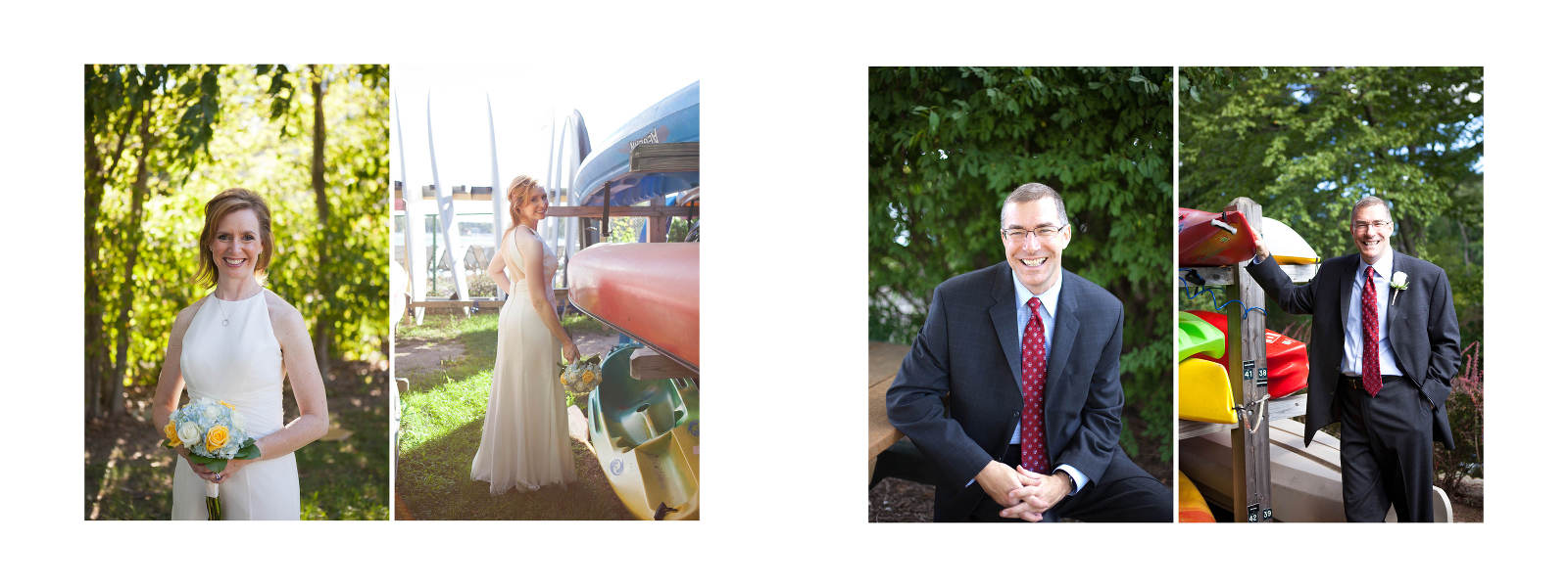
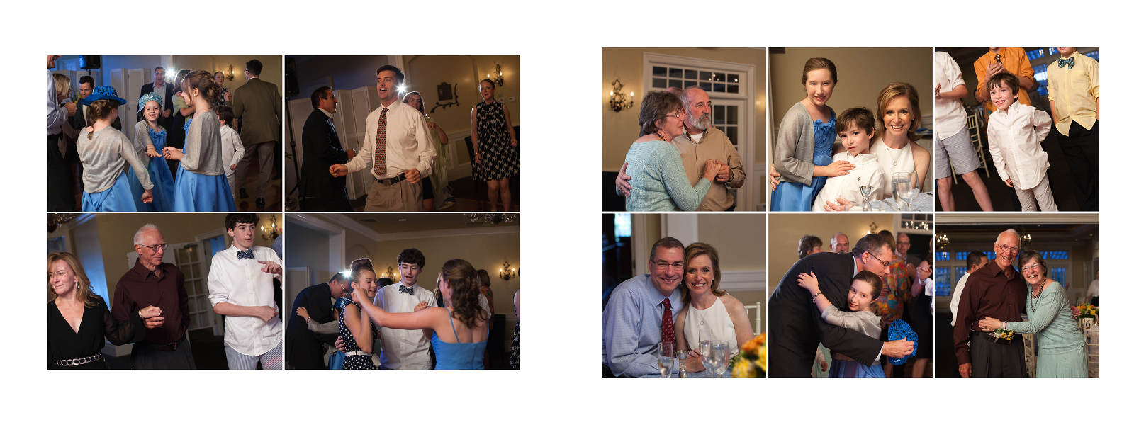
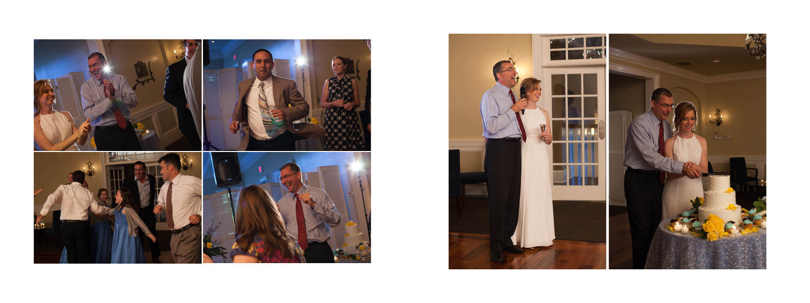
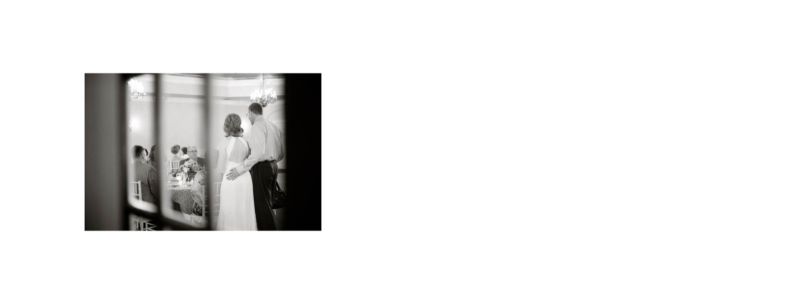
A modern yet classic album layout showcases Tom and Jodi’s colorful wedding images in a manor that highlights each image. I design all my albums in a chronological order telling the story of your wedding day using anywhere from 1-15 images per spread. I find that with this classic storytelling and simple layout with white background your images really stand out and tell the story of your special day. Their album will become a family heirloom and be passed down through the generations, I’m excited to share their layout in the slideshow below and a few images of the actual album they received!

I snapped a few images of their actual album before I shipped it off to them. I love the B&W cover photo paired with the color photo on the back cover. .jpg)
One of the reasons why I offer this album option to my clients is because of the bright and vibrant color printing on the matte pages. It’s simply gorgeous!
.jpg)
The album lays flat for easy viewing.
.jpg)
.jpg)

